It is not a huge shock that the art in Kamigawa: Neon Dynasty is stunning. It would be hard to screw up Magic + cyberpunk. What’s striking isn’t just how good it is, but also how *varied*. At the prerelease, an art discussion broke out and someone commented how they liked how Magic was veering away from the “Marvel house style.” I loved that framing. Compare:


No shade thrown to M. Villeneuve. Serra is a great illustration (related to one of my most beloved cards, Serra Angel) that would have absolutely blown my mind not long ago. But it’s not flavorful: it has the CGI-ish sheen that the 20-minutes-too-long climax of Black Widow also suffered from. Where as the art to Inkrise Infiltrator is just… gorgeous. Anime-influenced without being overt, great color balance. And even though it’s almost certainly digitally drawn as well, it doesn’t have that same-ness feel. And the rest of the art in this set delivers as well.

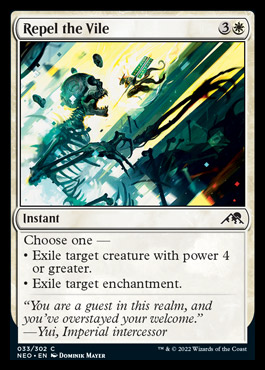
Let’s start with Dominik Mayer who has been blowing my mind for several sets now. This is a *very* welcome return to an artist that has an instantly recognizable style, like the legends (Drew Tucker, Quinton Hoover, etc.) of yore. I love the compositions and color balance. While sometimes the “aha! unexpected camera angle!” is a little gimmicky, I think it’s really effective when it’s something as haunting as Tamiyo’s Compleation.
sagas
The sagas and their vertical art has been some great experimentation. I know in Dominaria the artists experimented with different materials (fabric, glass etc.), and while I have no idea if they continued that in NEO, just look at these:
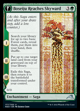
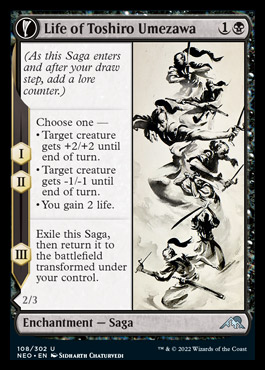
Boseiju either IS the origami to end all origamis or is a brilliant facsimile thereof. And the simple black ink on paper of Umezawa is similarly arresting. So, so good.
newcomers
The Neon Dynasty also has a host of what appears to be first-time artists that have a really distinct style.
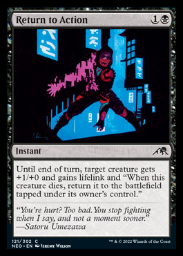
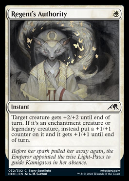
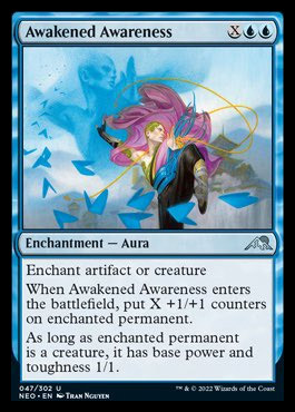
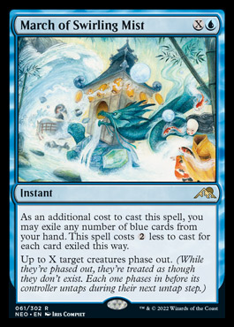
The digital-esque of the Jeremy Wilson, colored pencils (?) of Rowina/Santor, the comic-book-feel of Nguyen, to the watercolors of the Marchs (there’s a cycle for each color and they are each as unique). Love love love. More please!
And a farewell
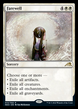
One of my (and the community’s) recent artistic loves has been Seb McKinnon, mostly because his style has been a breath of fresh air. Sadly, he appears to have completely jumped the shark with Q, Q-adjacent, vaguely/explicitly racist causes so we probably won’t be seeing any more of his work. Which makes this both poignant and ironic.

“But it’s not flavorful”, lol
LikeLike